Sunday, April 25, 2010

Thursday, April 22, 2010

Sunday, April 18, 2010

Brochure


In my design, I was hoping to achieve a look that really fit the company. I wanted to use their colors and make it something they would appreciate. I also wanted to create a brochure that gives just the right amount of information.

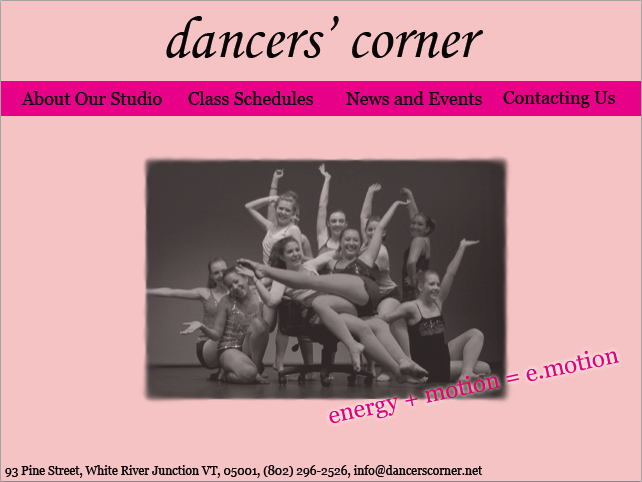
The first decision I had to make was the overall look. I choose pink and black for my color scheme because those are the colors that the company always uses and I think it is appropriate. I choose the font for the front cover because that is the font that the company uses. I choose my other fonts because they were my favorite for this company off the list that was given to us in class. Then I had to choose what information and pictures to use. I basically just picked what I believe to be the most important information to have in a brochure and then choose pictures that sort of illustrated what I was saying and made the layout more interesting at the same time.

I found making a gradient very challenging. I needed a lot of help and time to figure out how to use the tool in InDesign. Also, simply deciding what information was the most important was difficult.

The main problem I had to solve was making the gradient. First, I just played around with it for a while. Then, when that did not work, I looked up how to do it in the help menu and in our book but I still could not do it. Finally, I just used the help of others in class and that did work!

I am most proud of the overall look of my brochure. I think that the company would be very happy with it. It is cute and it gives a lot of information in an interesting way.

If I had more time I would work on the pictures. I am not sure if the program is just doing strange things to them but some of them are kind of blurry even though I edited them in Photoshop first. On the other hand, this happened to others as well so I just let it go for now.

Thursday, April 8, 2010

Concert Poster


I wanted my Concert Poster to be easy to read and informative first of all. I also wanted it to be visually interesting though. Plus, I tried to make the design reflect the band and the other graphics they have used before.

I choose red and black as my main colors because they really reflect the band's taste and style. I choose my font because I think it looks a little rock and roll which is perfect. I decided to make the time and place information a different font and color because this information needed to be really clear. All of my placement decisions were based on trying to create the ideal Z shape we discussed in class.

The hardest part of making the poster for me was deciding on the graphic. Since this is a small band they do not have many good pictures to use on posters. I also tried to use the magic eraser tool in Photoshop but it ended up looking unprofessional because I could not get the background to leave completely. I also had trouble deciding on the placement of things. I wanted to create a Z without leaving too much white space and this is difficult.

I think I solved both of these problems though. I like what I did with my picture. When it comes to the positioning, with the little information and graphics I had I think I filled up the space fairly well.

I am most proud of myself with sticking with the project. It was difficult, and I do not think that I really like the program we worked with. Quark was very frustrating to me for some reason but I just spent a lot of time with it and made it work.

If I had more time I think I would tweak almost everything. I am not completely satisfied with the placement. Also, I really wish I could have gotten the magic eraser tool to work with my photo.